Responsive images without layout shift
624 words • 2 min to read
I was scrolling through my website’s Lighthouse report, as one does in the afternoon, and there I was once again confronted by the frustrating message that the images on my homepage were “lacking an explicit size”.
OF COURSE they are, I internally mumbled and rolled my eyes. They’re responsive. Their size changes depending on their container and the browser window. I can’t possibly specify a fixed width and height in the HTML!
Ever since I made some updates to my homepage (notably a CSS-only infinitely scrolling carousel and a clean grid of cards that link to case studies) my lighthouse score had been suffering. But the previous, not as fancy, iteration was close to 100%. I had already compressed all the images as much as possible, and even converted them to webp, Google’s efficient image format. Yet the score was barely above 80%.
Defeated, I decided to click on Google’s Learn how to improve CLS out of curiosity. Skimming it, I started noticing the word “ratio” making frequent appearances. It got me thinking… what’s an image’s aspect ratio got to do with this? Lighthouse and VS Code are both telling me I need to set explicit, hard coded, width and height attributes. Unless…
Further reading confirmed my lightbulb moment suspicion: if you’re directly manipulating an image’s width and height using CSS, then the browser only uses the width and height attributes in the HTML tag to infer its aspect ratio.
Forgive my ignorance until now, but my mind was BLOWN.
I’d been led to believe—by the inherently misleading attributes and messages, but also interactions with other people—that the width and height you specify in the HTML are immutable. I was even once told by someone who was tasked with developing a design of mine, that we’d need to have a fixed set of dimensions per breakpoint for each image. As they explained, Google penalizes layout shift, and if we declare that an image is “100% wide”, the browser does not know how much space (more importantly, height) to reserve for it before it’s downloaded, making layout shift inevitable.
That made sense to me so I went along with it. Did I misunderstand? Possibly. In any case, what I learned today changes everything.
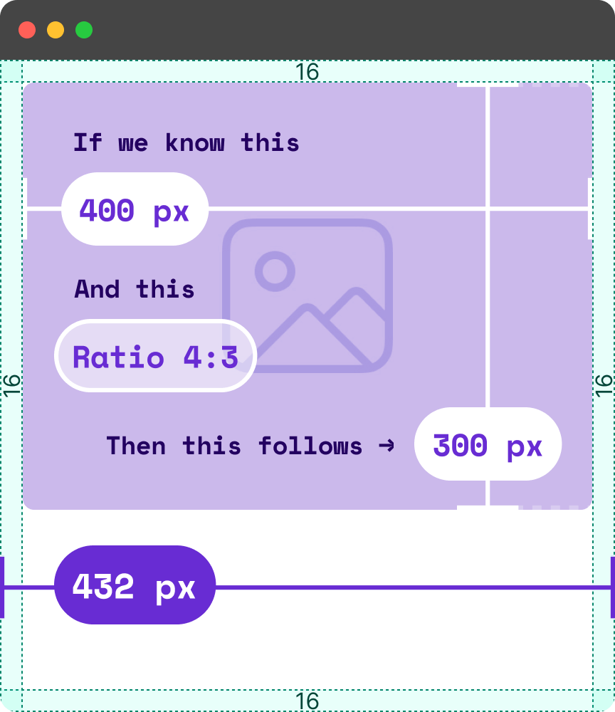
Yes, the browser can’t know the height of a not-yet-downloaded image if the only info we give it is width: 100%;. But suppose that we also tell it that the image’s aspect ratio is 4:3. Now the browser knows everything it needs to reserve the right amount of space!
To demonstrate, let’s say that, for simplicity’s sake, at the moment our website loads, the browser window is 432px. The body’s padding is 16px on each side, leaving 400px. The browser can now infer that the height of the image is 300px!

If the browser window was 832px, then there would be 800px available horizontally for our image, and the browser would know it has to reserve exactly 600px in the vertical axis!
And with that, my website’s performance score is back to 96%!

I initially had some reservations about posting this. I felt almost embarrassed to discover I was missing something so critical for years. But after discovering that a web dev friend of mine was also unaware of this, I decided to post it, in case it helps anyone.
If you found this useful, I’d love to know—hit me up!