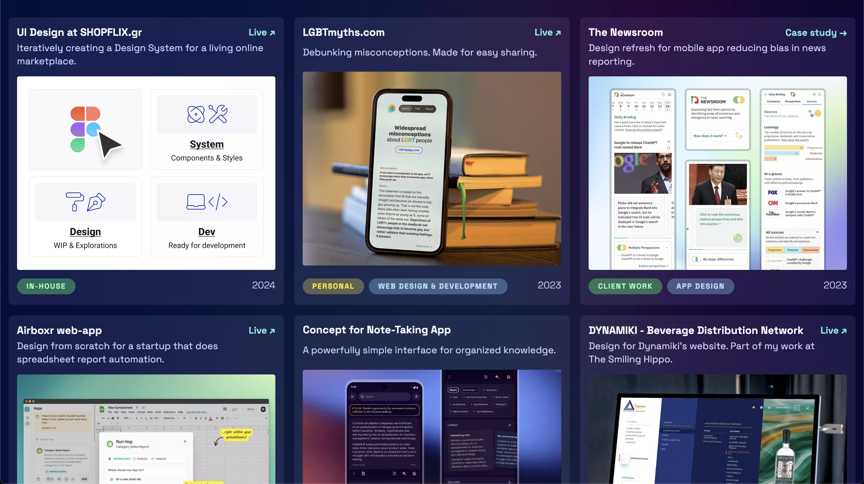
I wanted to improve how my portfolio shows previews of my projects, making it easier for visitors to see what I can do. My old grid layout wasn’t engaging enough. Many of the cards didn’t provide enough context, making it hard for visitors to understand my work. Sure, most cards were clickable, but most led to the project’s live website, so my involvement was still unclear.
Solution
I switched to a horizontal scrolling layout for each project.
More images
Each project now has several images, giving a better idea of my work. That, in turn, might lead to more interest.
Space for informative descriptions
There’s more space to explain what I did, the skills I used, and the impact of each project.
Clear navigation and mental model
Separate buttons link to the case study and the live website. If neither is available, there are no buttons. Now expectations are clear.
In the grid layout, the entire card was clickable, and in it, there was a small piece of text reading either “Case study →” or “Live; ↗”, but a lot of people didn’t notice them.
Reminder: when you make something yourself, you pay attention to all the details, no matter how tiny. When others see it, they first notice the obvious things, and most won’t be interested enough to look for the details. Guide them, show them what you want them to see.
Unexpected issues
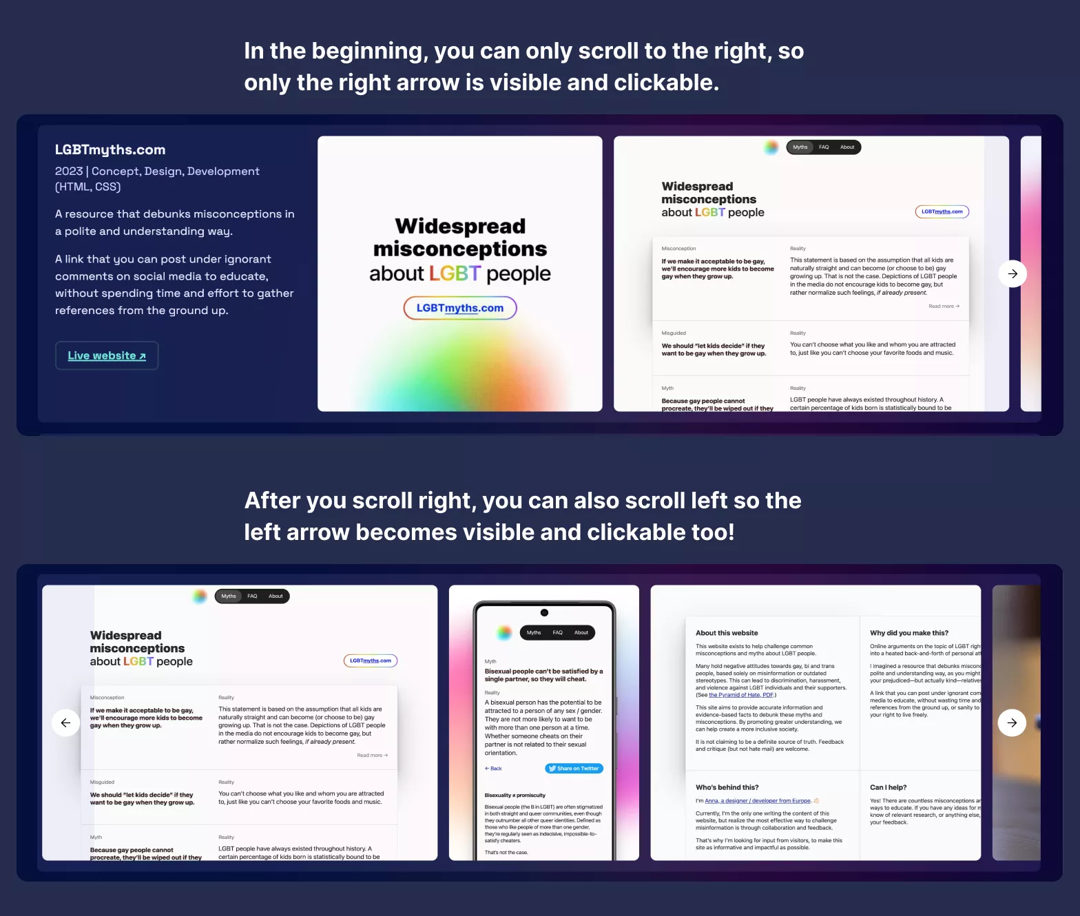
After I was done, I realized horizontal scrolling is nice and all if you have a multi-directional trackpad, but what if you have a typical mouse instead?
I had to add a way to either drag or click to scroll. Considering that dragging to scroll with a mouse feels forced, I opted for clicking.
Alas, it wasn’t that simple. I tried to set it up so that the right arrow would only appear when it’s possible to scroll right, and vice versa. But that sometimes didn’t work, and the arrow never appeared. After an excruciatingly long “conversation” with ChatGPT, the issue was solved when I wrapped the entire JS script in this:
window.addEventListener('load', () => { }
It finally worked, but then I wondered how discoverable that “feature” was. Would visitors instinctively hover over the right part of the container to scroll? I asked a couple of people, and the answer was no. They couldn’t immediately tell the area was scrollable.
On top of that, I realized that on a lot of mobile screens, unless you already knew, you couldn’t tell that it was possible to scroll horizontally, since the first image was about as wide as a typical smartphone screen.
To address those:
- For the mobile issue, I made the first images of each project smaller, so the second image would always be visible and give an indicator you can scroll right.
- For the desktop issue, I made the arrows visible at all times, provided you can scroll in that direction. To ensure they’re always visible, I added a small semi-transparent overlay underneath.
Conclusion
Theoretically, the new layout helps engage visitors better.
To find out, whenever I know someone has visited my website, I’ll ask them what they thought of the way the projects are presented.
This also seems like a good chance to try out A/B testing and compare the time visitors spent on the page and which links they clicked on. I might do that (it requires some additional setup on my Jekyll “backend”), but it still couldn’t tell me the most important thing: to what degree do visitors understand what my skills are? That I can only find out by asking.
PS: Here’s the previous version of the homepage with the grid layout.
Let me know what you think!
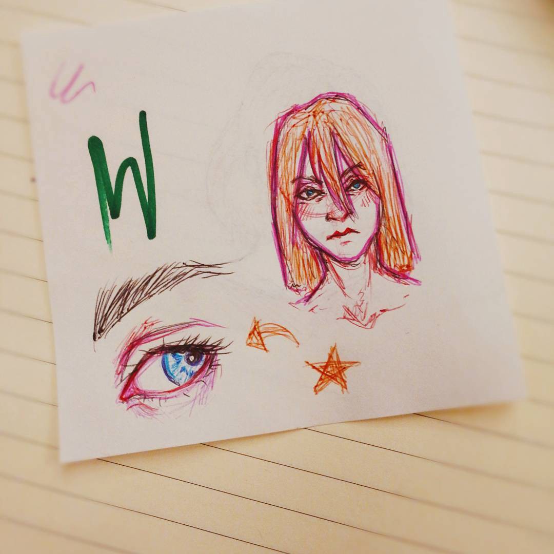
]]> The one on the left is actually the “refined” piece I spent more time and energy on, even though it ended up looking messy and stiff.
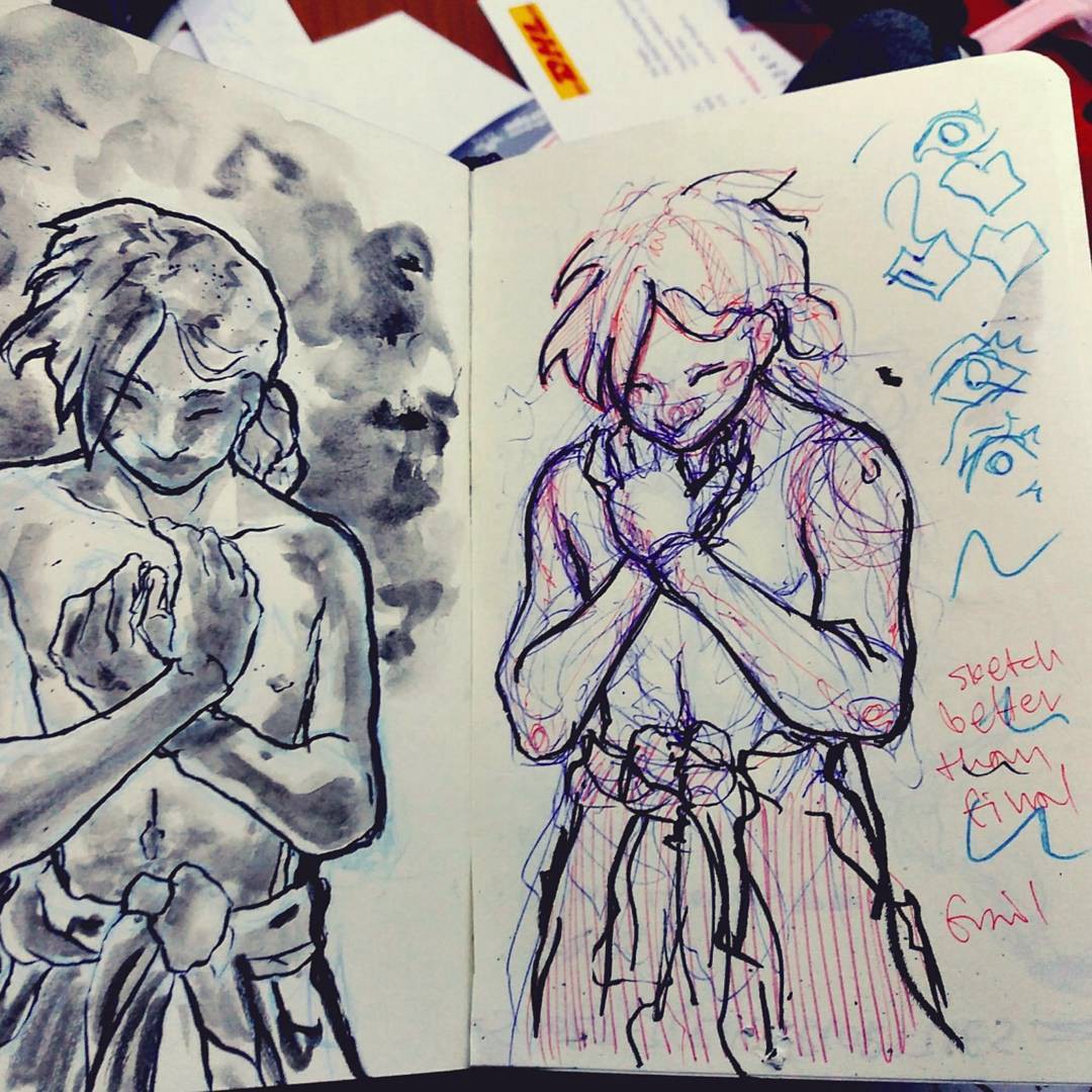