
Smart Carousels with CSS
569 words • 2 min to read
You’ve undoubtedly seen many carousels on the web. You know how usually the content gets cut off?

The issue arises because, when designing for the web, we need content to have a maximum width. Otherwise, if someone has a wide monitor, the layout looks broken or they have to move their head all the way from left to right to read it.
When we give containers a maximum width, anything that doesn’t fit inside them gets cut off and becomes invisible. In a carousel, that means as you scroll, the content disappears abruptly before the end of the window. (Unless the window is narrower than the max width you set. In other words, this isn’t a problem on mobile.)
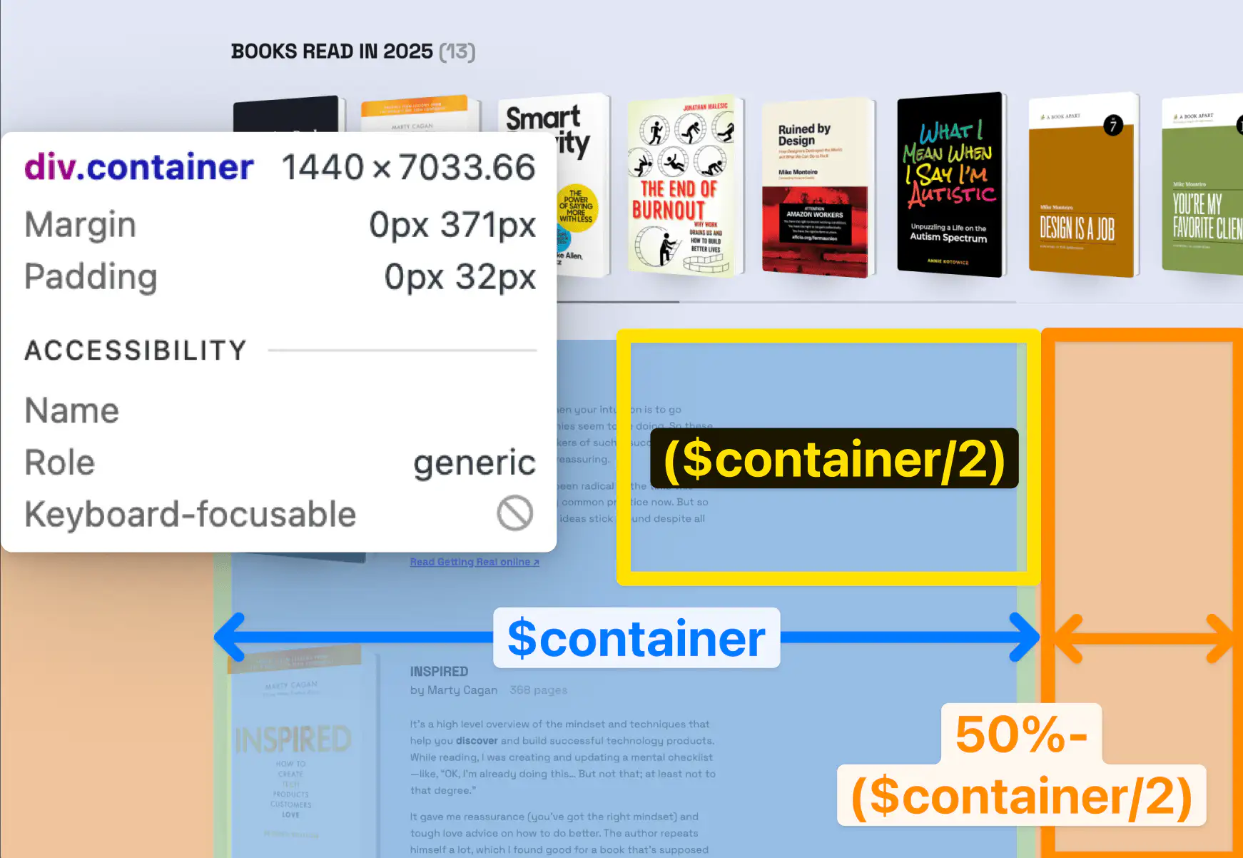
Everything on a website is a box. The carousel is also a box. When you put something in the box, it appears on the leftmost side. If you want it to show up more to the right, you can add padding on the left. So hypothetically, we could add padding to align the first book with the left edge of the other sections! Alas… the padding would need to be different depending on the window’s width!
So for a long time, I thought this was an unavoidable problem. But then I saw a carousel that worked right on Apple’s website! So… there was a way!
Thankfully, because this is the web, you can right-click → Inspect Source on any website to see exactly how it’s built. I then adapted it for my website, and ta-da!
The code ↴
$container: 1240px; /* Yes, I use Sass. Yes, I know we have CSS variables now, but I like it and the pre-processor is built into Jekyll, which builds my site anyway! */
$container-padding: 32px;

.book-carousel {
    padding: 0 calc(50% - min($container, 100%) / 2 + $container-padding); /* [Half the screen] - [half the container] + [container padding * 2] */
    overflow-x: auto; /* makes it horizontally scrollable */
    scroll-snap-type: x proximity; /* so you can’t stop in between books: it “snaps” to the closest element in the X axis */
}
The magic part is:
calc(50% - min($container, 100%) / 2 + $container-padding);
We’re basically saying:
- Take half of the screen.
- Subtract half of the max-width container from it OR half the screen (in which case the result is 0), whichever is smaller. This gives us the effective margin on each side.
- Add the container padding. Now we have the exact distance between the content of the other sections and the edge of the viewport on each side!
And the coolest part is that this is all just CSS! Which means, if scripts don’t load (bad connection, on the train, unknown error, browser that blocks scripts), the carousel still works the same (progressive enhancement 😎).
Did you notice the custom scrollbar? Don’t ask me how that one works because I asked Cursor to build it. You can see the code on GitHub though.