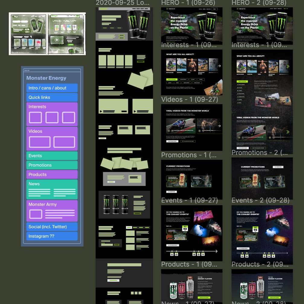
Monster Energy Homepage Concept
As part of a design challenge, I performed market research and then redesigned the homepage of Monster Energy in less than a week.
Unlike its main competitor, Red Bull, Monster Energy caters to a younger, more rebellious demographic.
A minimal homepage wouldn’t do. It had to look fresh, bold and not too tidy; to immerse visitors in the Monster world and fit in with their identity and interests.
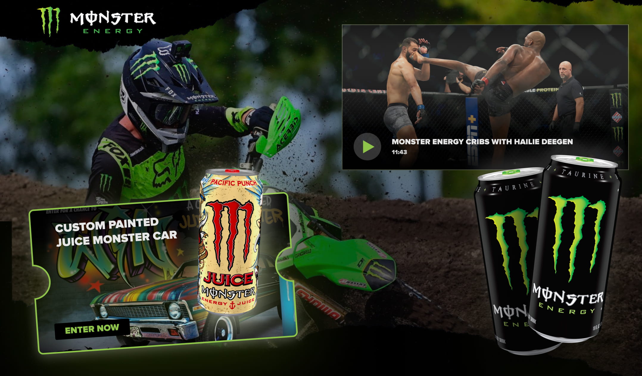
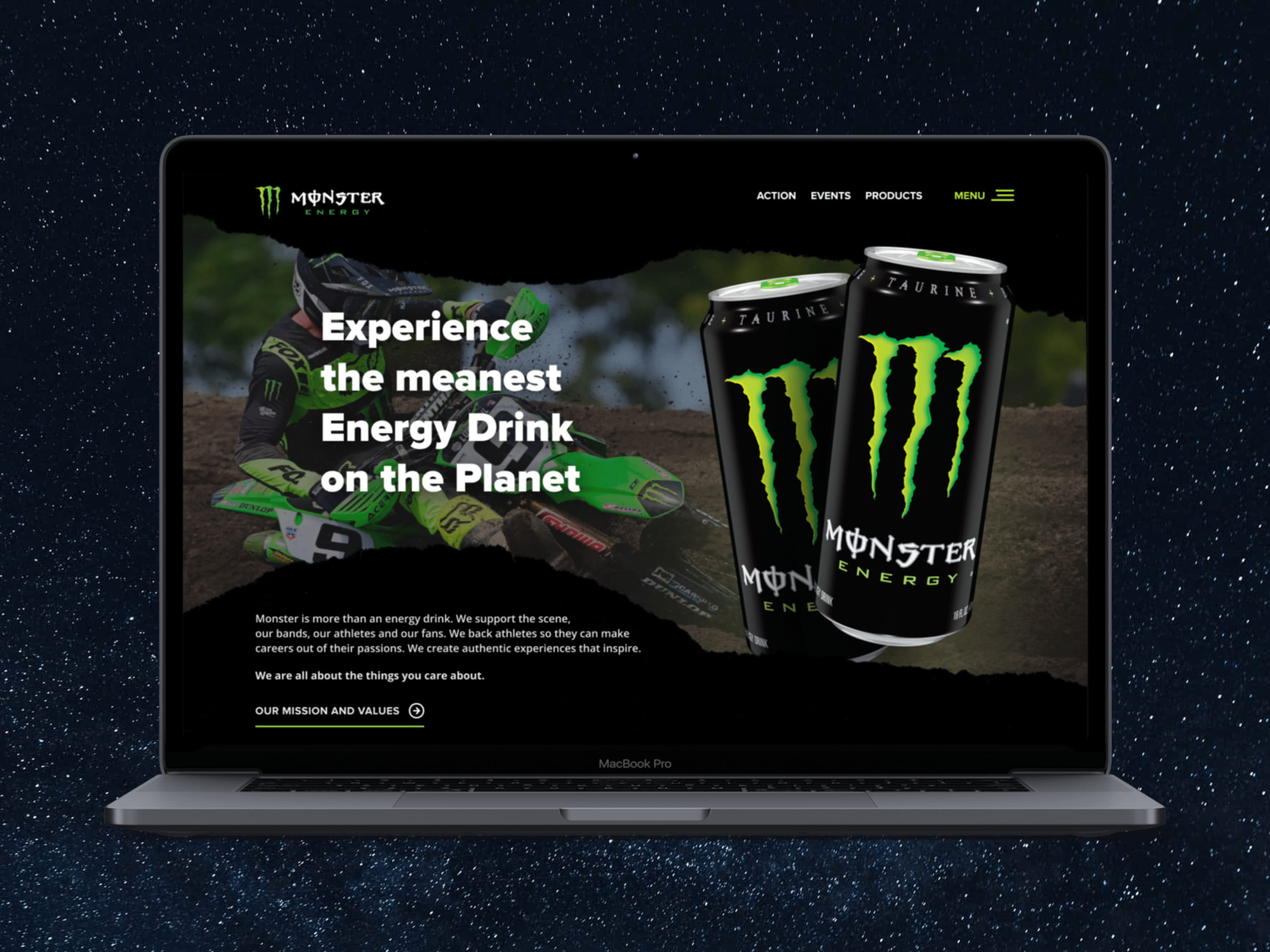
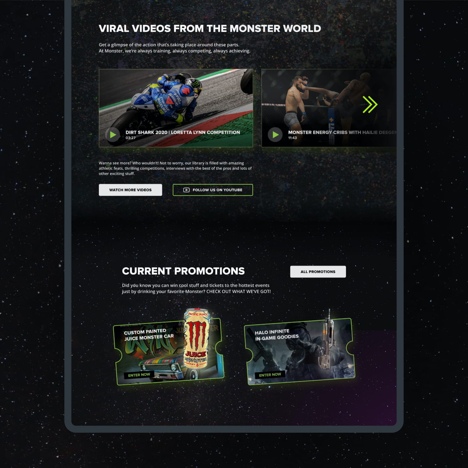
The idea is to guide the visitor on a journey, show them how Monster supports what they are passionate about and immersing them in the adventurous world that the brand has created. I used ripped paper shapes, textures and tilted elements to break the monotony of the grid and convey wildness.
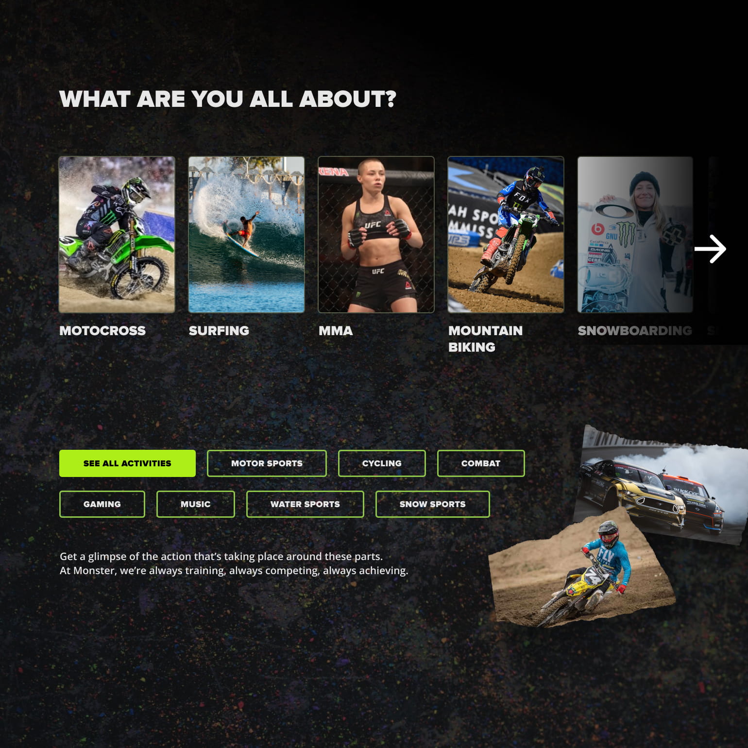
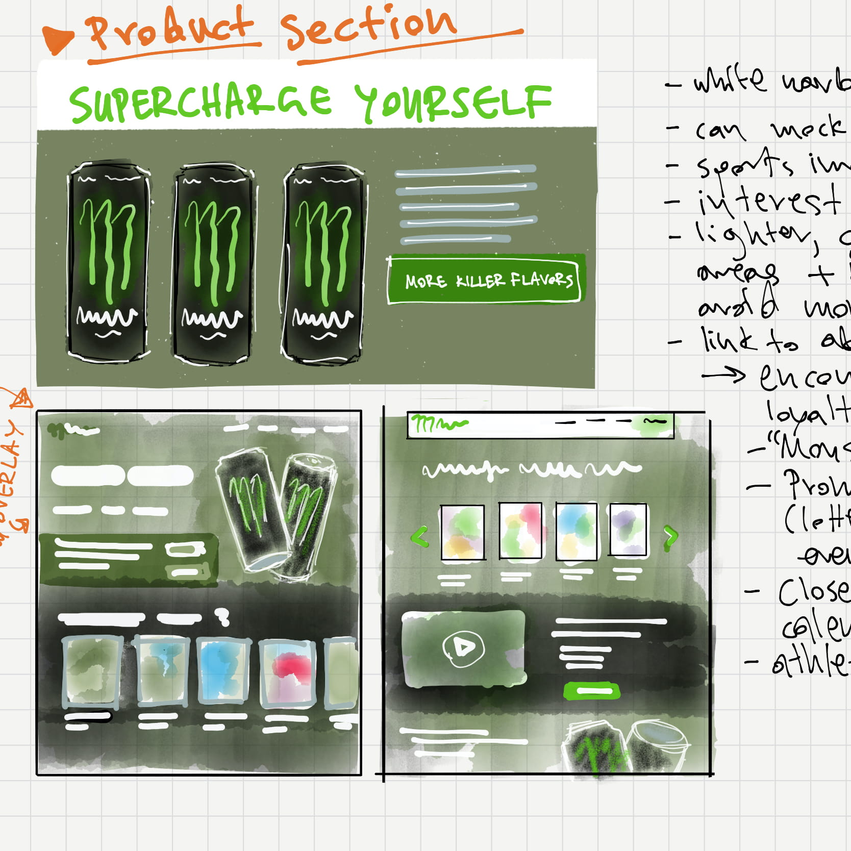
As a potential customer, I wasn’t aware of all the different Monster Energy sub-brands (Dragon Tea, Muscle Monster etc.) so I highlighted some of the less-known flavors, and included a vivid description of what drinking Monster Energy is supposed to feel like.
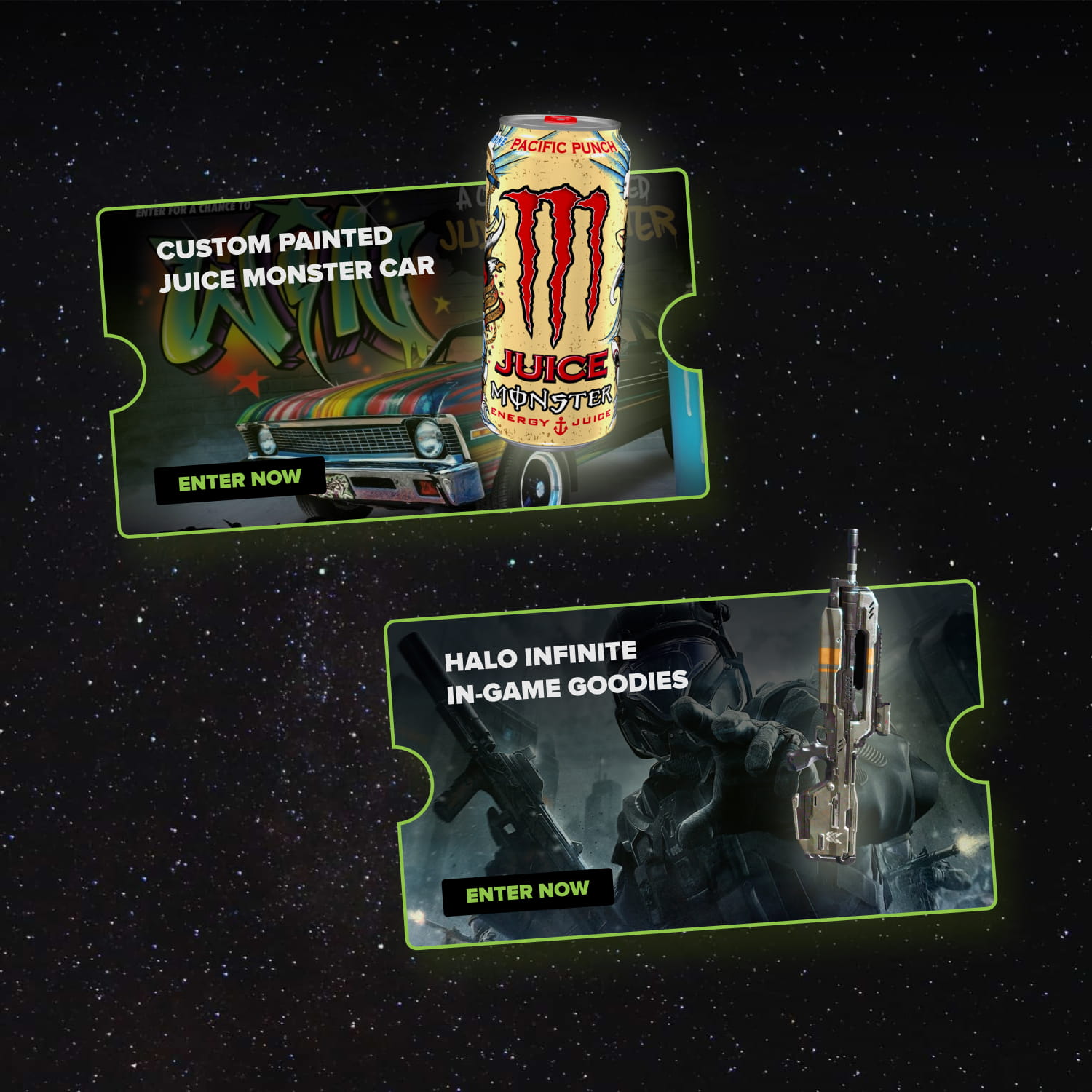
I gave the “Monster Army” program its own section, since it shows that Monster isn’t all talk about helping athletes live their dream and promotes positive feelings towards the brand.
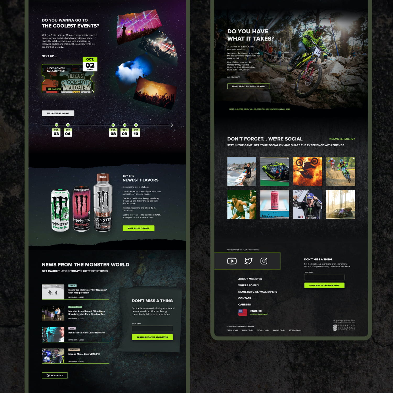
Ideally, visitors who feel that the brand’s mission resonates with them would follow Monster Energy on social media to be kept up to date on promotions, new products and events.
To that end, I put a preview of the brand’s Instagram feed on the bottom of the page, above the footer.
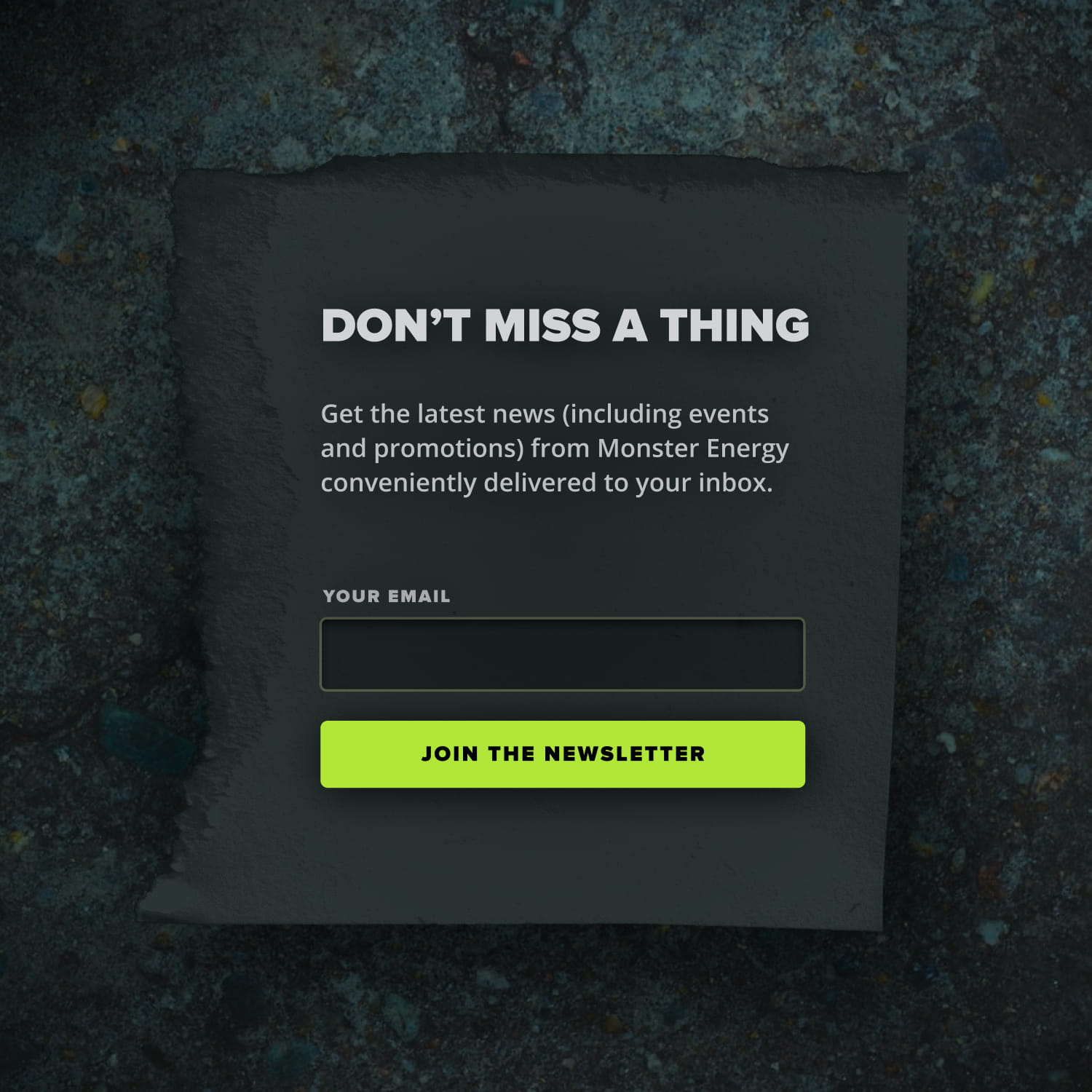
Right below that is the footer, where visitors can access additional pages, subscribe to the newsletter (which they can also do at the News section), and change the site’s language in case the IP location-based system gets it wrong.
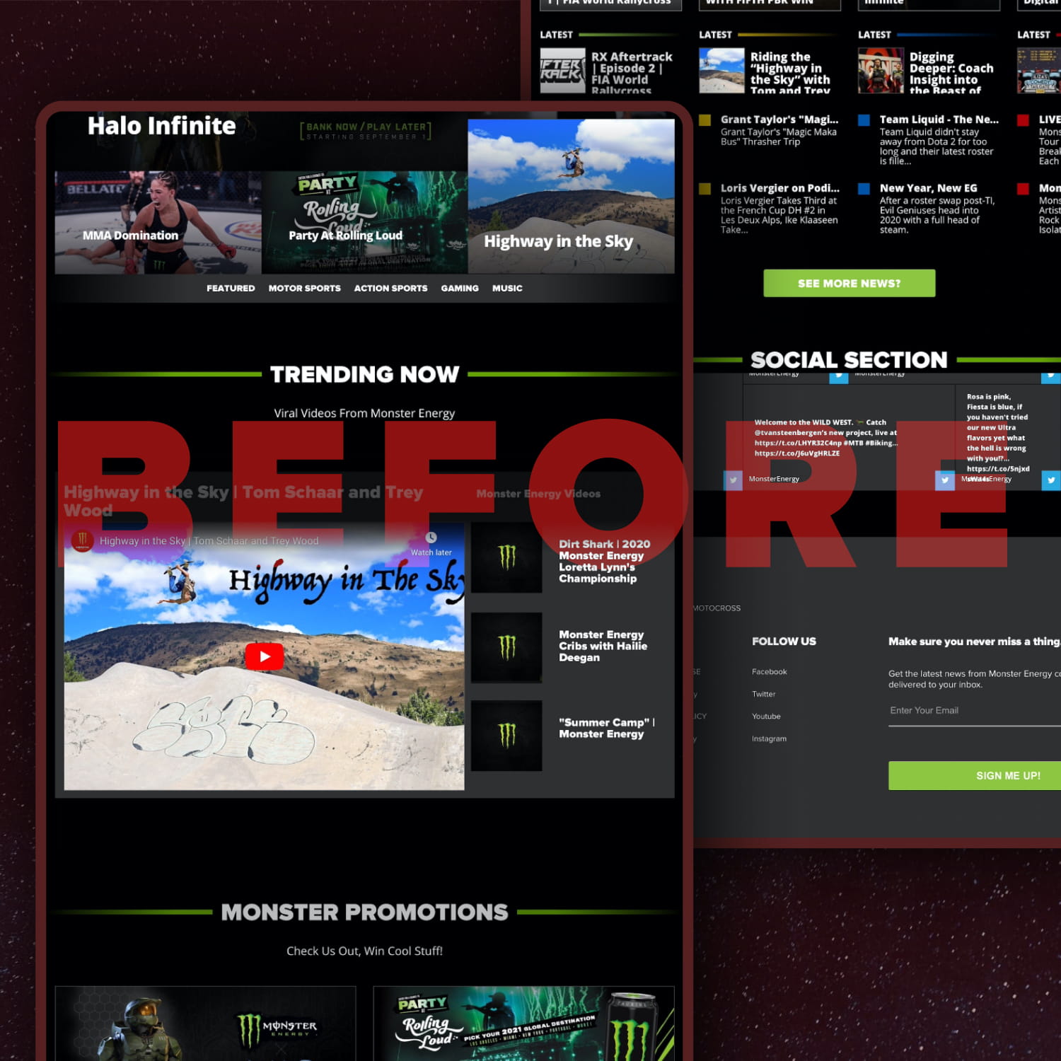
The old homepage looks dated, a bit bland and frankly kinda boring. Not to mention the overlapping text elements, lack of images in the social feed, tiny margins, low contrast buttons and other visual and accessibility issues.
People with a passing interest in the Monster Energy drinks, sponsored sports or events would likely lose interest and leave.
The images don’t look enticing, although Monster posts many fantastic photos on their social media. The news section feels cramped, many titles get cut off and it’s impossible to visit a specific news category.
I can’t imagine anyone telling their friends to check out the current page.
The redesign tells a story: “Monster is all about what you care about; Monster is part of your world.”
You see pictures of your favorite sports, how Monster supports the athletes you admire and learn you can be one of them, thanks to Monster’s sponsorship program. You discover you can experience the Monster lifestyle in the real world, by entering promotions and winning cool stuff, attending events and, of course, drinking one of the many varieties of the energy drink.
You like what you see, you feel inspired and you want to feel that more often so you follow Monster on Instagram, Twitter and YouTube. You tell your friends about it, you get news from Monster, you drink the drink and attend events.
That’s the sort of experience that I believe this design can facilitate.